Visualizing Workflows with Splunk and D3
At DrDoctor we do a lot with SMS, we let patients reschedule appointments, book appointments when they move to the top of a waiting list and we provide patients with the ability to move their appointment forward by sending them lists of slots as capacity becomes available.
In all of this we use workflows to represent what is going on between the patient’s mobile phone and our system. We call them workflows but really they are just state machines built on top of the excellent .Net library Automatonymous.
Like all startups we want to ensure that we are always delivering an excellent experience to all our users, which means keeping an eye out for those who get stuck and changing the workflows accordingly.
Splunking State Changes
We’ve been using Splunk as part of our reporting system for about 4 months now. We put lots of different events into it, including a huge variety of events which are generated by our workflows. Whenever an instance of a workflow changes state we publish an event similar to this:
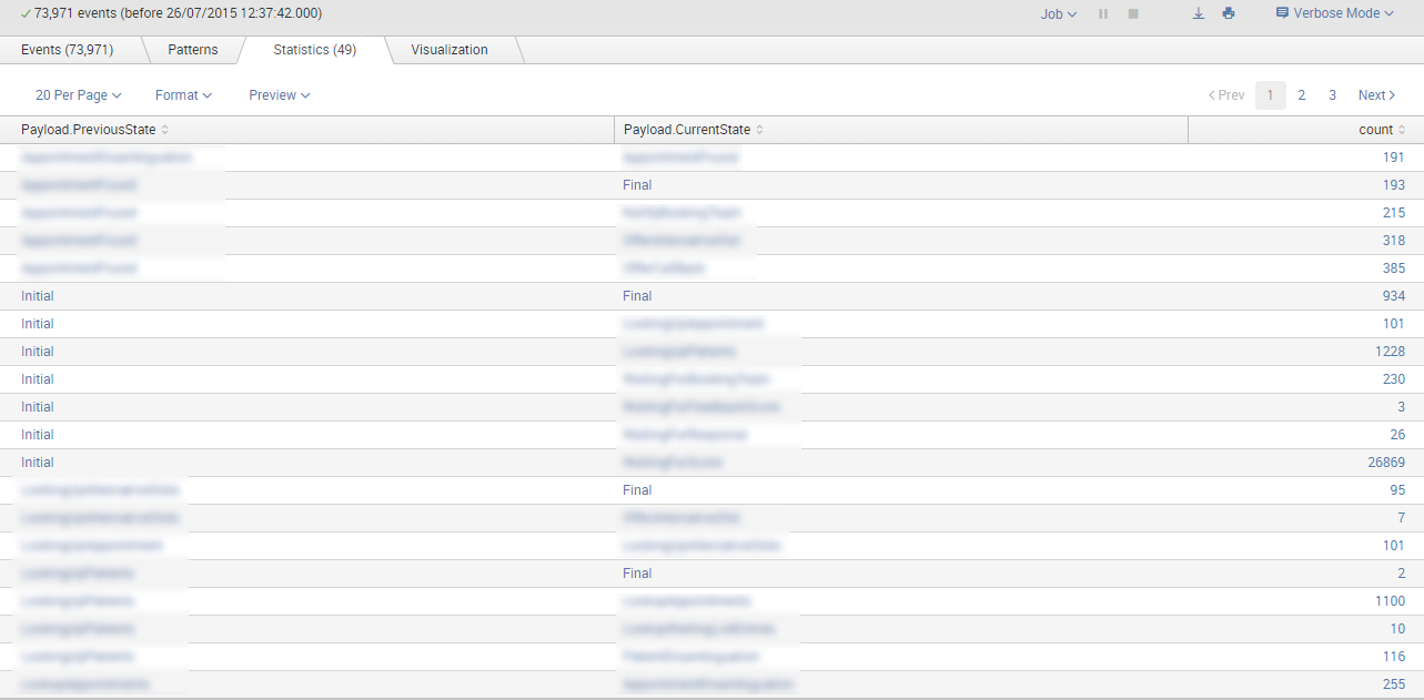
Listing all the different state transitions can be done with the following Splunk search:
|
|
Which produces the following table of events
Splunk and D3
That table of data isn’t really very useful when looking at it by eye, it requires a fair bit of work to trace the path through a given workflow. That’s where D3 comes into the picture - D3 is a JavaScript library used to produce interactive charts. It’s incredibly powerful, but with that power come with a bit of learning curve.
D3 charts aren’t built directly into Splunk, however if you’re happy to learn a bit of JavaScript and a small bit of Python’s Django framework then you can do some pretty cool stuff with the Splunk Web Framework.
To produce the D3 charts shown below I followed the instructions from the Web Framework getting started tutorial, but then used a modified version of the Sankey chart based on this example by Colin Fergus. The reason for this is that I wanted to be able to show loops in the chart.
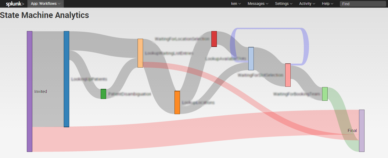
I then made a few modifications so that any link connecting to the “Final” state that doesn’t go through the second last one is colour red, and those that do coloured green. The red paths highlight to us the sad path through the workflow. So for example if we can’t match a phone number to a patient them we would transition to the final state and colour this red.
Real-world examples
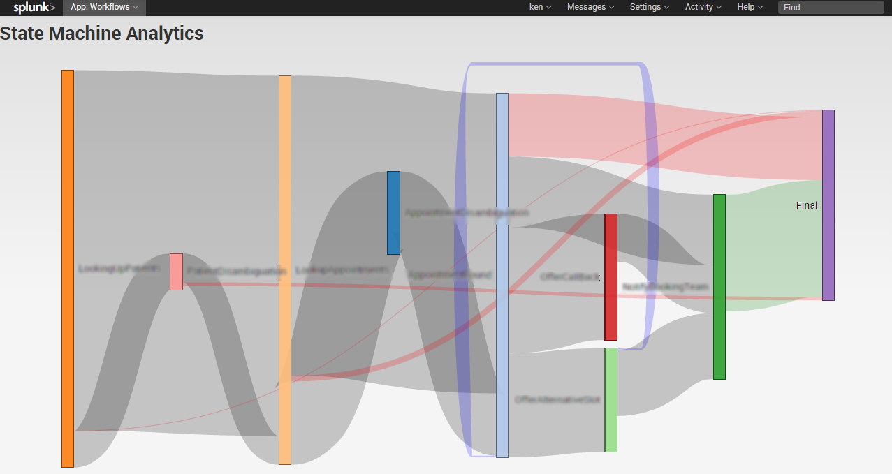
The first example represents the appointment rescheduling workflow.

As you can see it can be fairly complicated. Don’t forget that this is showing the aggregation of all the different state changes, given that there are multiple paths through the workflow not all people will go through all the states.
We notices that a fair few people were getting to the point where they were set alternative slots but never selecting one, we theorized that perhaps they needed the option to request more, so we added that functionality in. As you can see from the blue backwards loop not many people have actually used this.
Here is a further example from our partial booking workflow, where we ask patients to book their appointment when the reach the top of a waiting list. What’s interesting about this is that a large number of users (patients) never actually even start the process of booking. 
Wrapping Up
We have tried out various methods of visualising the paths through our workflows that our users take. We used to do this with an Excel spreadsheet which we filled up with data from a nasty SQL query and then used a column chart to show where people exited, this was before we were using Automatonymous. It worked for a while but wasn’t really sustainable as a solution due to the manual process.
As our workflows have developed and we as an organisation have evolved we have worked hard to improve how we do our reporting. With the main aims being:
- Accessibility - decision makers and developers alike should have quick and easy access to information
- Discoverability - new pieces of information should be exposed effortlessly
- First class experience
As you can see from the charts above, Splunk has certainly delivered.
If you’re interested in seeing the code which makes these charts possible then leave a comment below.

🍪 I use Disqus for comments
Because Disqus requires cookies this site doesn't automatically load comments.
I don't mind about cookies - Show me the comments from now on (and set a cookie to remember my preference)